
Subscription Redesign
Background
Practice Fusion’s main product the “EHR” (Electronic Health Record) helps medical providers run their business as well as treat their patients. They can save patient health records, schedule appointments, create billing reports, and send medications electronically to pharmacies. The product has been free for many years, but a few years ago made the decision to start charging customers using an annual subscription model. This became Practice Fusion’s main and highest source of revenue.
The original design has 4 steps the customer needs to complete to sign up for an annual subscription.


Business goals
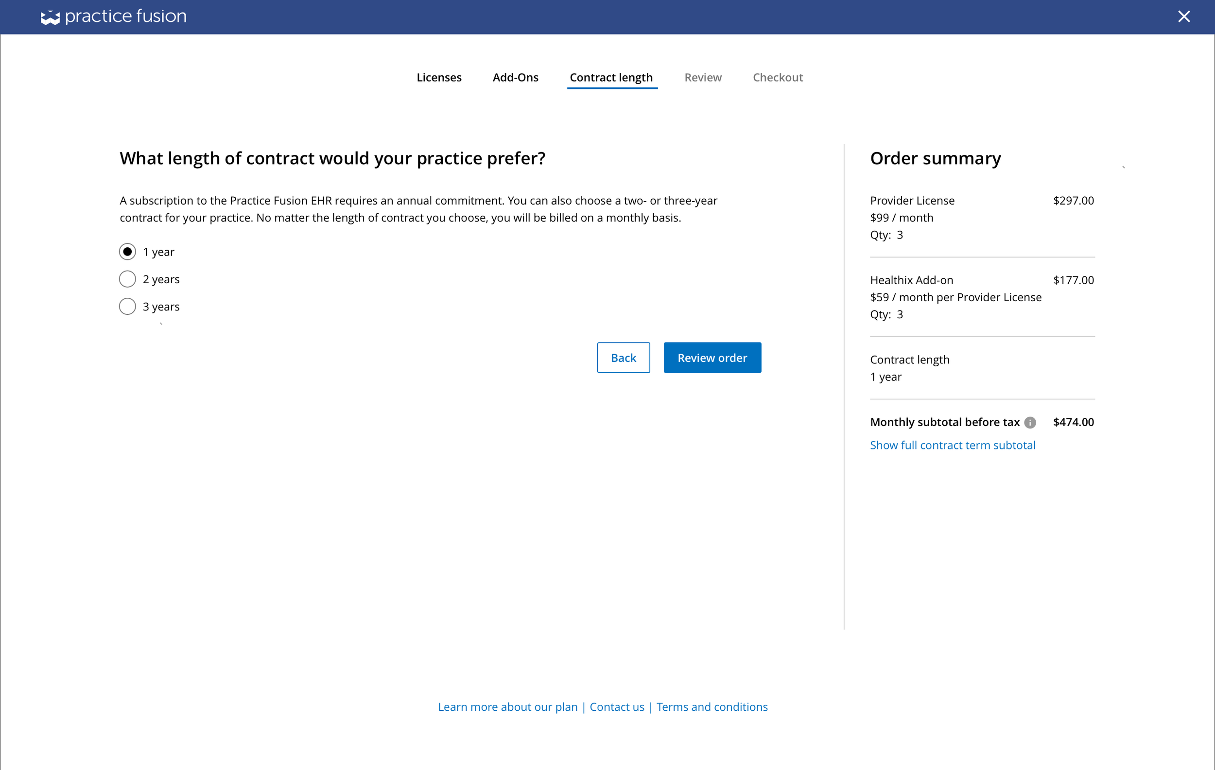
After a year of launching the subscription model, Practice Fusion wanted a way to increase revenue and adoption. 1) Instead of just a 1 year contract, allow customers to choose a 1, 2 or 3 year contract and 2) allow the purchase of third-party integrations or “Add-ons” at an additional price.
Team
PM
Lead Product Designer (me)
User Researcher
Front and Back end engineers
Key stakeholders: Sales, Account Executives, Customer Support team, Implementation Specialists
My role
My role as lead designer included the following: collaborated closely with the researcher to lead workshops and identify pain points, redefined the problem and got usability issues prioritized on the roadmap, collaborated cross functionally to drive impactful changes, complete end to end flows, delivered specs and worked with 3 engineers to implement new designs.
Timeline
6 months
Discovery
Usability issues on Step 2, highlighted in red
I worked closely with the researcher and analyzed the data in Mixpanel.
We discovered that within a 1 year timeline, the overall completion rate was only 15%. Step 2 in the flow (where customers entered how many licenses they want to purchase which was directly tied to revenue), had the highest drop off rate: 76%.
Upon reviewing that screen, I also noticed a number of usability issues:
No branding
High cognitive overload - lots of text and decisions for the user to make
The field to input number of licenses is hard to find due to the amount of content
Lack of hierarchy - the table format makes it hard to know where to focus
Screens less than 1440, the main primary buttons are not visible unless the user scrolls
“I want to do this, but it isn’t my battle to fight. We don’t have time for this.”
The researcher and I quickly informed the PM of the shocking data and proposed taking time to dig deeper into the problem. However, the PM pushed back saying we didn’t have time for this, and that there were more pressing projects next on the roadmap. I brought up my concern, pointing out that the screen with the highest drop off had a direct financial impact on the revenue. If this screen is a point of friction and the business goals are to increase revenue, we would be building on top of a broken foundation. The researcher then proposed for light internal research given the time constraints. With all these reasons, the PM was convinced and agreed to an extra week of investigating.
Create allies
I partnered with the researcher and shadowed customer facing teams’ calls to leverage their knowledge and observe what questions potential customers had. This was also an opportunity to build a closer relationship with them.
We also led 2-day workshops to understand what worked, pain points, and areas of improvements. They were very excited to share their insights, and appreciative I wanted to improve the flow as it would reduce the volume of calls they receive on Subscription-related questions.


The top 3 insights I gained were:
All users had some level of confusion with names and descriptions of licenses. The most commonly asked questions were: “What defines a Clinician? What is Secondary? What's included?”
Customers didn’t know how to answer some of the questions in the workflow.
Customers accidentally bought too many licenses and asked for refunds, or didn’t buy at all due to the expensive cost.
User problem
The research validated that Step 2- the license screen with the highest drop off, was the biggest problem in the flow. Without customers understanding this screen, they wouldn’t be able to move on and purchase an Add-on or select a multi-year contract. This clearly was the bottleneck for our potential customers and financially for the business.
Buy in
With all the insights and data points we gathered, and also the support from the customer facing teams, the researcher and I were able to convince the PM and stakeholders. They agreed that these problems should be addressed, and prioritized redesigning the flow to improve the usability, on the roadmap. 🎉
Goal
With more clarity on the problem space and clear user and business needs, I narrowed the focus and redefined the goal: How can we create a friction free subscription flow that supports more functionality, reduce the drop off rate on the license screen, and increase the overall completion rate from 15% to 50%?
Design explorations
Given the Licenses page was the most problematic of the flow, improving that step was a top priority. I had brainstorm sessions with the PM, researcher, and Account Executives to come up with more intuitive license names. I also came up with several design explorations to share with the team and stakeholders.
exploratory design directions
Concept 1
Explored a way for users to enter the number of different roles and staff members the practice has. Based on their answers, the product could recommend how many licenses were suitable for them to purchase. This solution would essentially reduce the users’ effort to read a bunch of text to make a decision.
However, the legal team advised against this idea as recommendations posed too many legal risks.
Concept 2
Similar to the original design, but removed the table format styling to incorporate hierarchy, and explored ways of hiding help-text under information icons to create more focus and reduce cognitive load.
This direction was risky as it would be assuming the customer clicked on the information icons. Over the years, I’ve learned that some users do not click on i-icons. Hiding important copy could result customers not understanding the license structure.
Concept 3
This concept included new license names and copy, and replaced the paragraphs of copy with a static infographic that visually explained the license structure to solve for customers’ confusion on the types of licenses and different permissions. This direction also explored a shopping-cart idea to reflect more of a traditional and familiar online shopping experience for users.
Concept 4
This concept also included new license names and copy, and explored an equation to clearly show how the monthly cost was calculated, as well as a table below that dynamically updated the license breakdown with its permissions to solve for customers’ confusion on what included based on how many licenses they entered.
User testing
After sharing these designs with the PM and stakeholders, we all agreed Concept 3 and Concept 4 addressed a lot of the usability issues. I worked closely with the researcher to test the two designs with 12 participants. My main goal was to evaluate if the design and copy changes resolved the points of confusion.
“I immediately knew what number of licenses I would need with the word “Provider” – and the graph was helpful.”
Before & After
I incorporated the insights and feedback from the user-testing, and collaborated with the PM, researcher, designers, legal, and cross functional team members to make rounds of iterations on designs and copy. I worked closely with the UI engineer to implement the designs, including design for accessibility such as color-contrast, and larger touch targets for a population of our users who are older than 65, and have vision impairments.
Before


AFTER
With the final designs, I accomplished the following:


Addressed usability issues to reduce friction and confusion for user
Broke up the flow into more dedicated and distinct steps with clear actions on each screen to reduce cognitive load.
Replaced the confusing license structure copy with clear and concise definitions, supported with an intuitive and dynamic infographic.
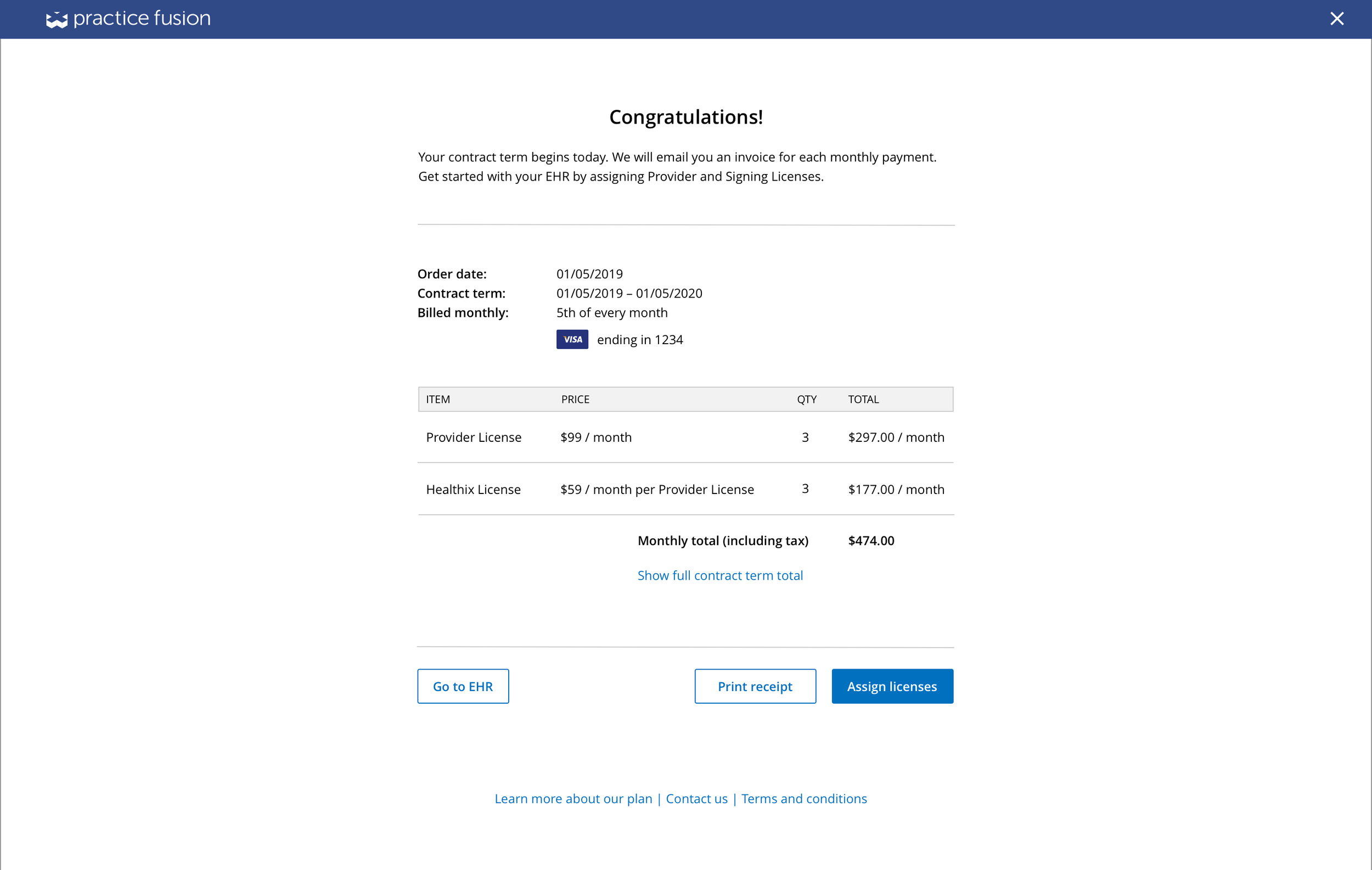
Displayed a persistent running calculator to show what they entered, the cost breakdown, and what’s included.
Improved discoverability of and accessibility of primary buttons.
Incorporated Practice Fusion’s branding and design system patterns to maintain consistency across product.
Designed for accessibility using larger touch targets and improved color contrast.
Implemented new functionality to fulfill the 2 business goals
Provided ability to purchase add-ons to help streamline user workflows, adopt new customers, and increase revenue for the business.
Provided ability for user to easily choose multi-year contract options to increase business revenue, and lock in current price for customers.
Outcome
As a reminder, the first year of the subscription showed a 15% completion rate. And step 2- the license screen, had a drop off of 76%.
After 1 year since the launch of the redesign, the drop off rate on the license screen decreased from 76% to only 12%. The overall completion rate went from 15% up to 69%, exceeding our 50% completion rate goal. 🎉
In addition to the success metrics, we heard from a Customer service director that there were almost 30% fewer calls for subscription related questions. 🎉
Takeaways
Perseverance pays off: I was able to strengthen an argument by showing data, building empathy, creating allies, and bringing up the financial impact convinced the PM to prioritize problems that were not originally on the roadmap.
Create allies: Working with cross functional teams built relationships while also leveraging their knowledge, i gained more understanding of our users, and provided a partner to advocate for changes.
Next steps
Continue to monitor performance of the new designs by tracking the performance on Mixpanel.
With our new partnerships across the org due to involving them in the project, I want to check with customer facing teams and continue that loop of feedback to understand if there are still points of friction or additional issues. It’s a big win- not only with the relationships we built with each other, but ultimately for both the user and the business.