Claims submission & status
A 0-to-1 initiative to build a fully integrated, native Revenue Cycle Management (RCM) system that bridges clinical charting and billing.
Read case study →
A 0-to-1 initiative to build a fully integrated, native Revenue Cycle Management (RCM) system that bridges clinical charting and billing.
Read case study →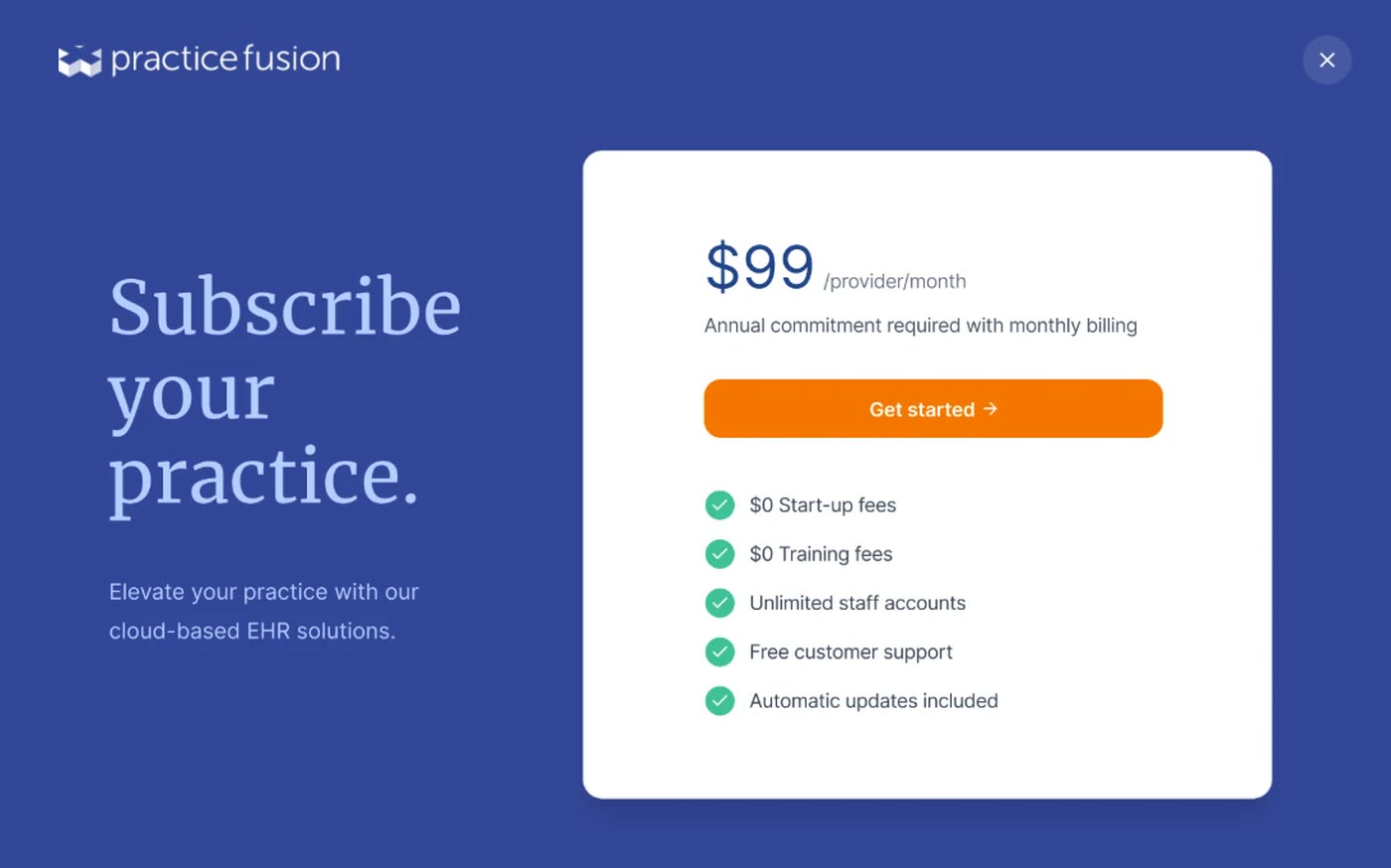
Led a subscription flow redesign that increased conversion 360% while launching new revenue streams.
Read case study →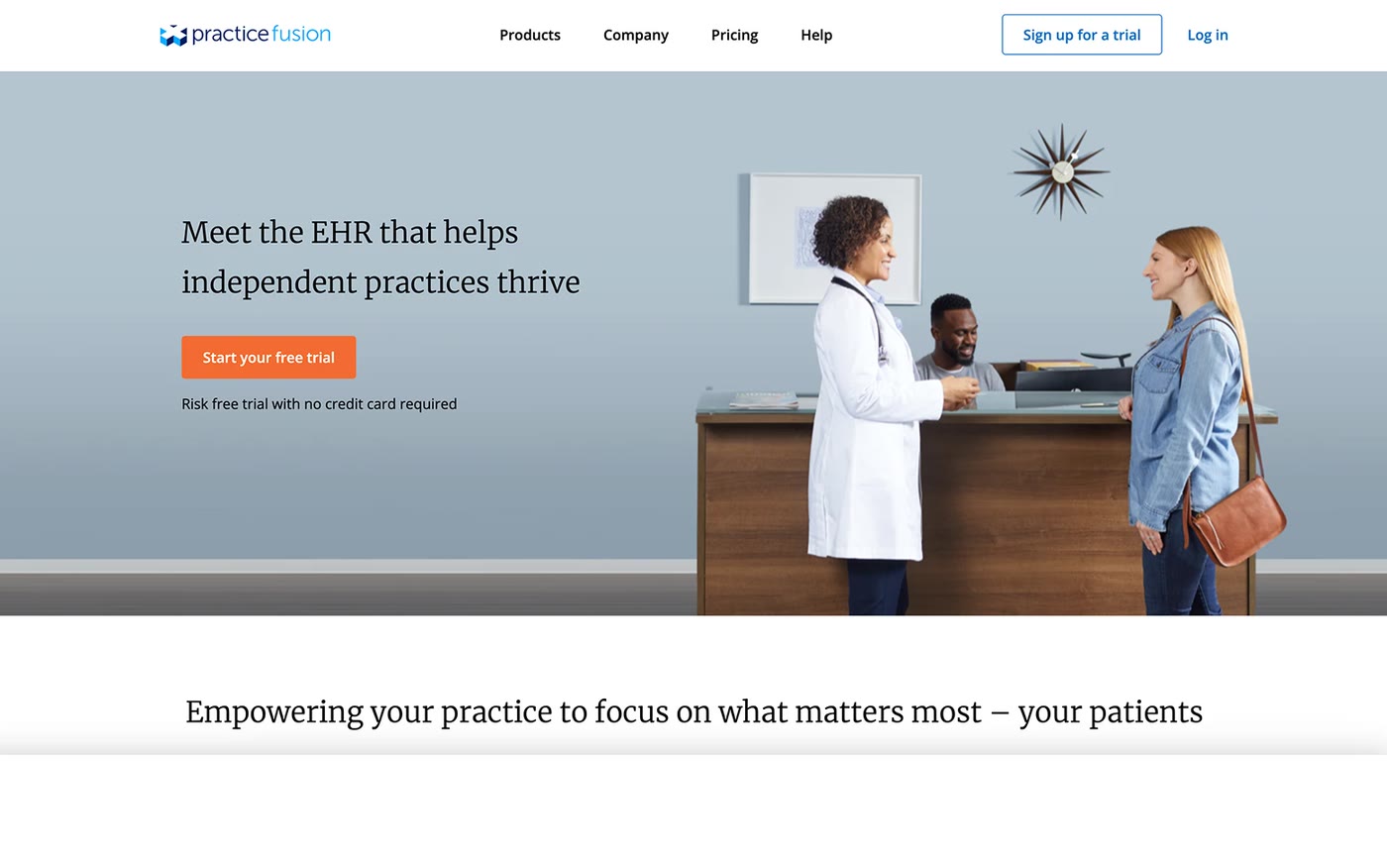
A design-driven initiative that strengthened the company's identity while delivering more meaningful content for customers.
Read case study →
 the cookie questCal Academy
 painting break
 plant care
I’m a Senior Product/UX Designer with a background in branding. For the past decade, I’ve tackled data-dense B2B workflows in the healthcare space, but my focus is always the same: turning complex systems into simple, human experiences that genuinely make a meaningful impact on people.
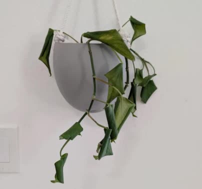
On a quest for the 'perfect' chocolate chip cookie recipe. Current leader: Bon AppétitAt the California Academy of Sciences with a coffee in hand, just being curious about animals!Painting or doodling. A nice break for my brain and fingers.Reviving my dying houseplants.A 0-to-1 initiative to build a fully integrated, native Revenue Cycle Management System (RCM) system to bridge the gap between clinical charting and billing.
Independent medical practices must navigate a highly regulated and fragmented process to get paid for a patient visit:
To help practices bring billing in-house and avoid third-party handoffs, Practice Fusion initiated a 0-to-1 project to build a native Revenue Cycle Management System (RCMS). While the broader project was paused due to shifting business priorities, this case study focuses on my core designs: an automated Superbill workflow and an active Claims tracker.
Submitting medical claims requires flawless data entry and precise medical coding—a massive administrative burden shown in the traditional claim form below ↓. Because Practice Fusion lacked a native claims tool, practices were forced to either outsource billing entirely, or pay for clunky third-party integrations. These fragmented workarounds caused constant “tab-toggling”, a complete lack of visibility into the claims lifecycle, and manual data errors that directly led to lost revenue.
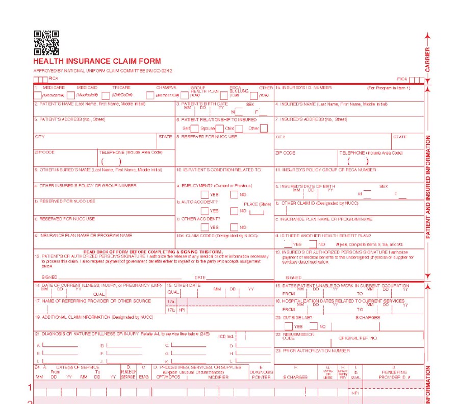
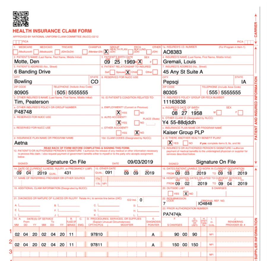
The CMS-1500 claim form, blank and filled in
How might we bridge the gap between clinical charting and claims management to give staff easier accessibility and immediate visibility to protect revenue?
To navigate the ambiguity of medical billing, I collaborated closely with the User Researcher and recruited 7 specialized back-office professionals (billers, coders, and office managers) and 5 healthcare providers for 30-minute generative interviews to understand their current workflow and pain points.
I spend so much time after-hours coding. It’s tedious and a big pain. I just want my evenings back so I can spend time with my family.
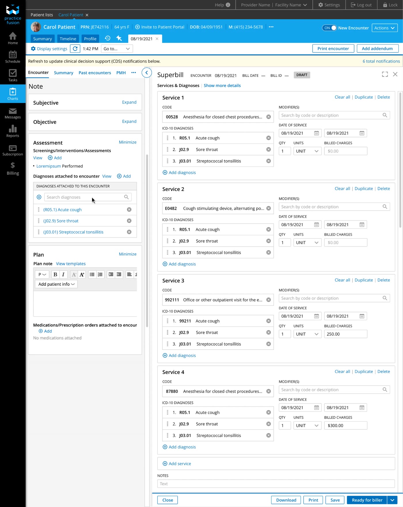
This forced users to constantly toggle back and forth just to cross-reference clinical notes and manually re-enter patient diagnoses:
If we knew what was happening with the rejected claims, we’d have intervened and fixed the errors. We lost so much money.
To solve for the toggling and removing data re-entry, I focused on contextual approach by transforming the Superbill into a split-screen “workspace” alongside the Encounter for seamless cross-referencing. I also eliminated manual data re-entry by auto-populating diagnosis codes directly from the clinical encounter into the Superbill:
While the search menu speeds up single-code entry, I further optimized repetitive visits (like routine physicals) by introducing custom Billing Templates. Configured in Settings alongside a customized Charge List, these templates allow practices to bundle multiple services together.
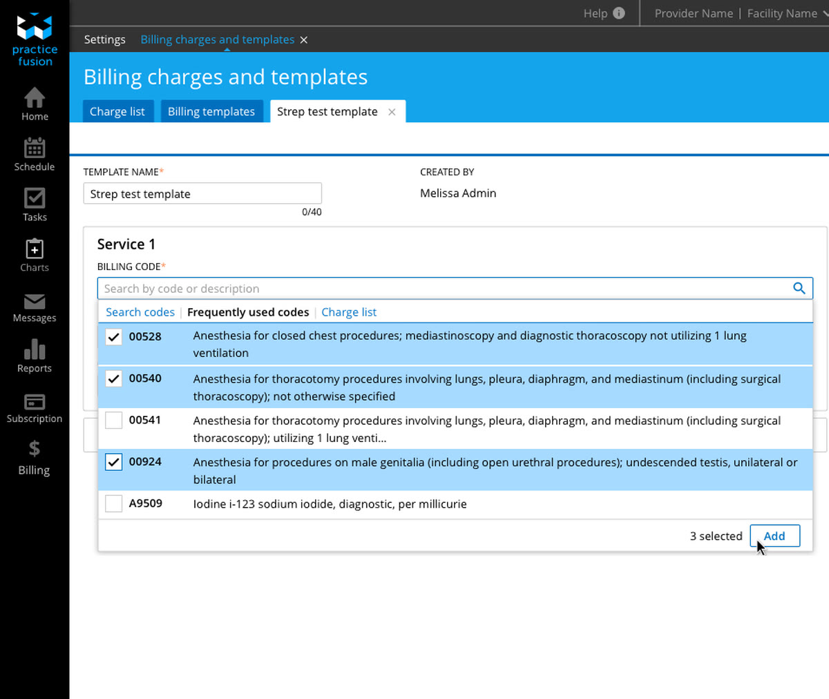
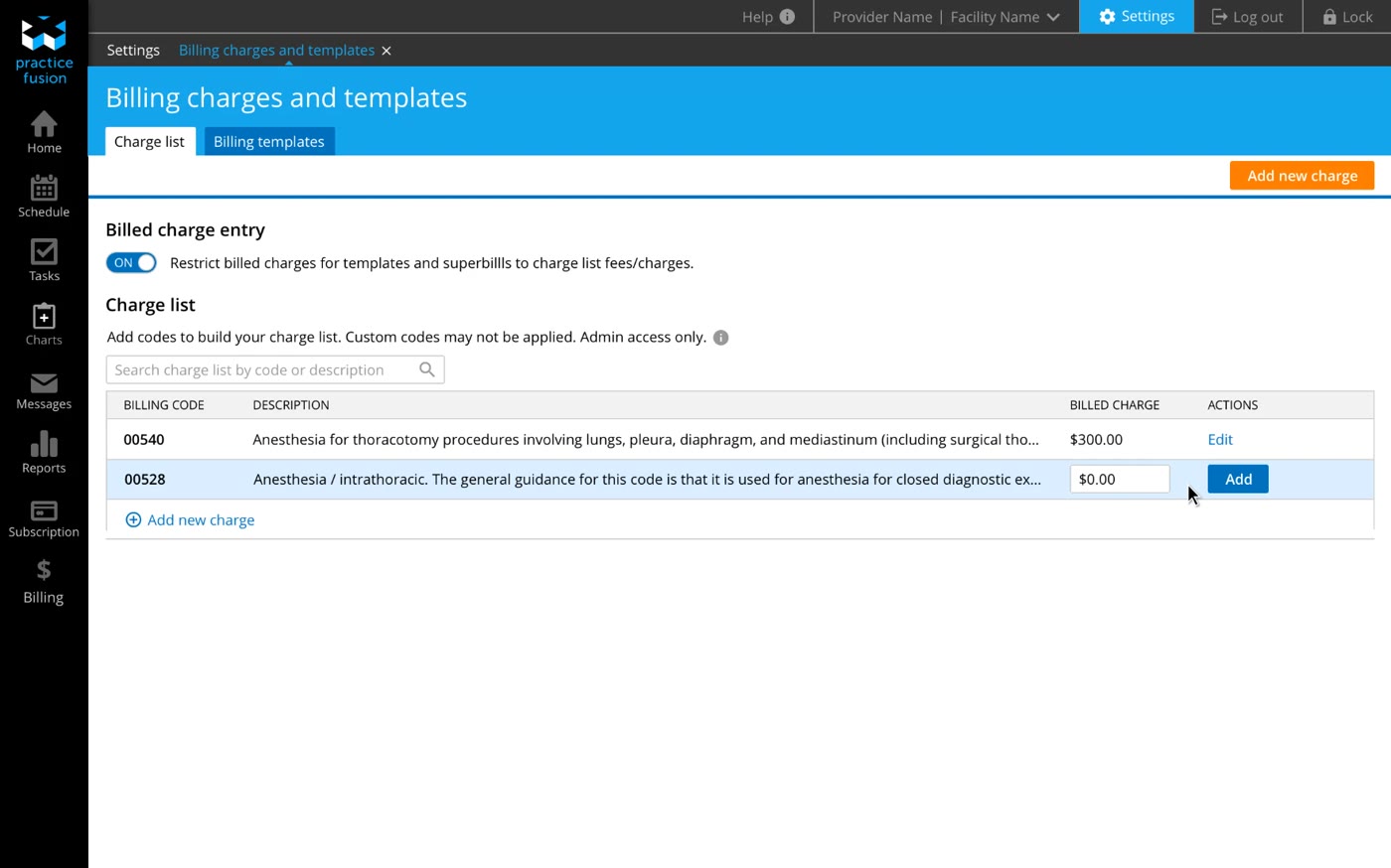
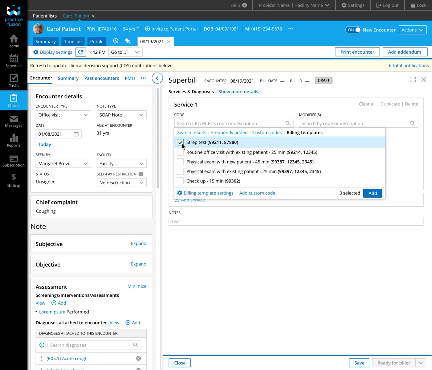
Then within the Superbill, with a single click, staff can instantly auto-populate all necessary procedure codes and their exact pre-set fees making it more efficient and less error-prone for both the clinical staff and billing staff to complete their tasks.
Once the medical coding is complete by the providers in the Superbill, I designed a “Ready for biller” state where the Superbill can be “converted into a claim” to an in-house biller without leaving the system.
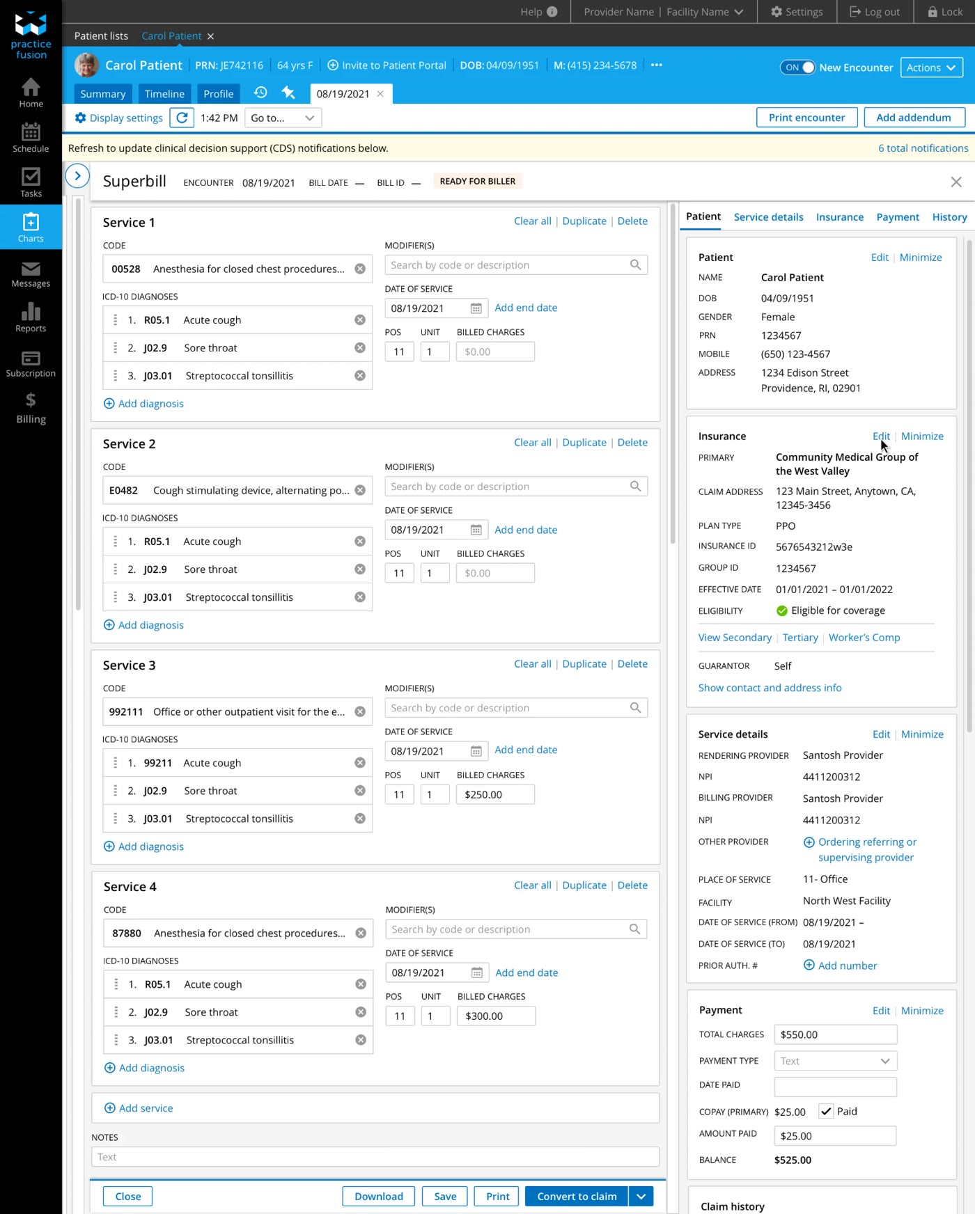
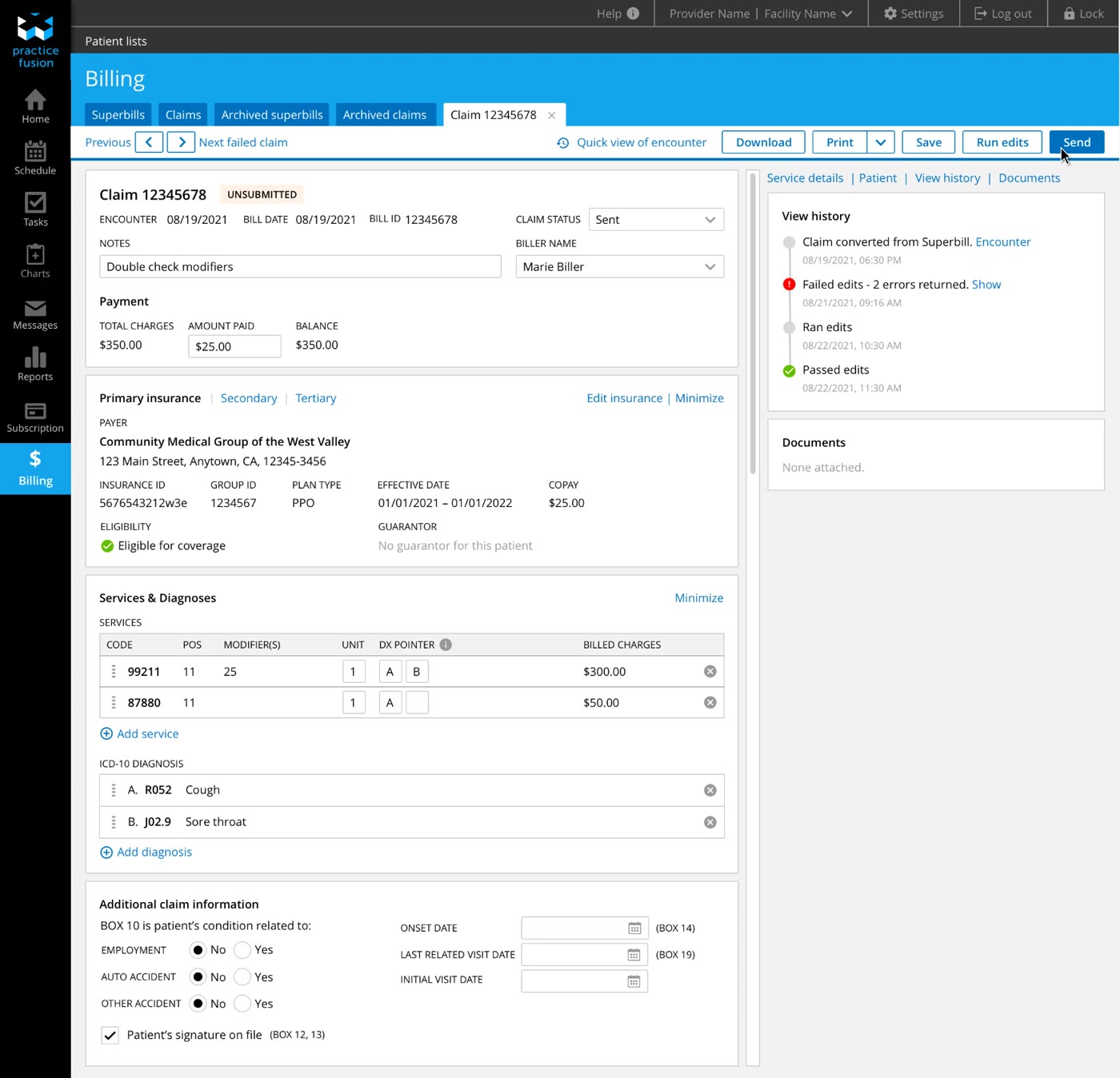
The new UI reflected the necessary fields required in a traditional health insurance claim form, automatically collecting and pulling data from various parts of the EHR into this one workspace, as well as including a “Run Edits” function to automatically scrub the claim (scan for invalid or missing data) to ensure a clean submission, just like a Clearinghouse.
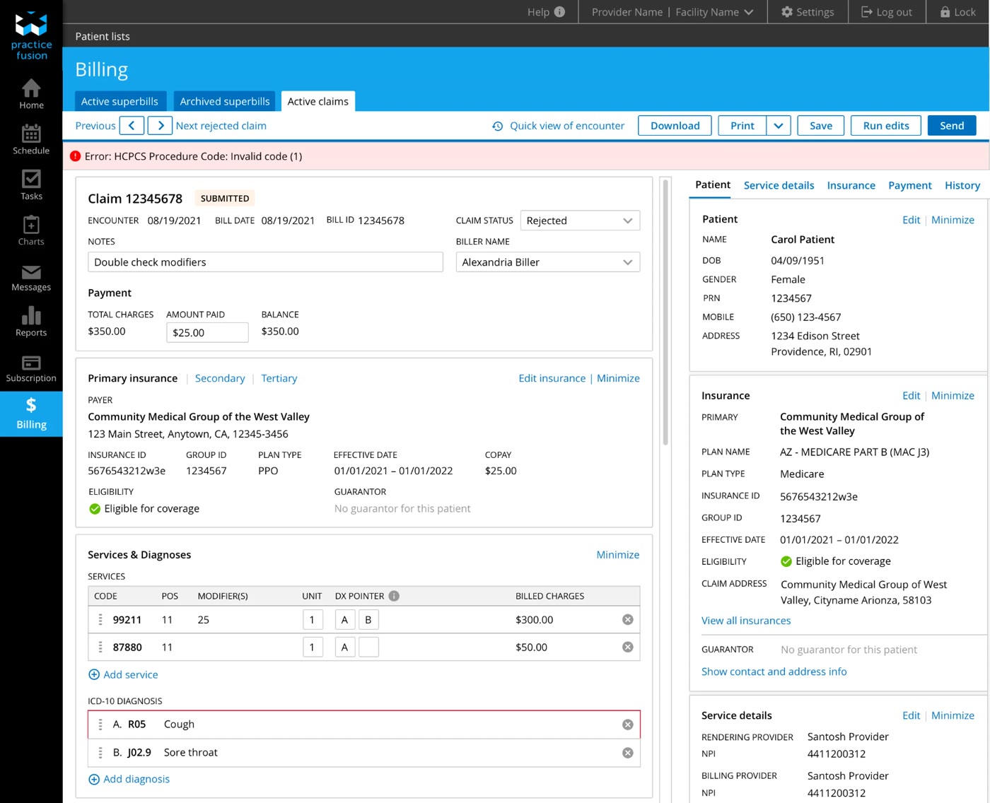
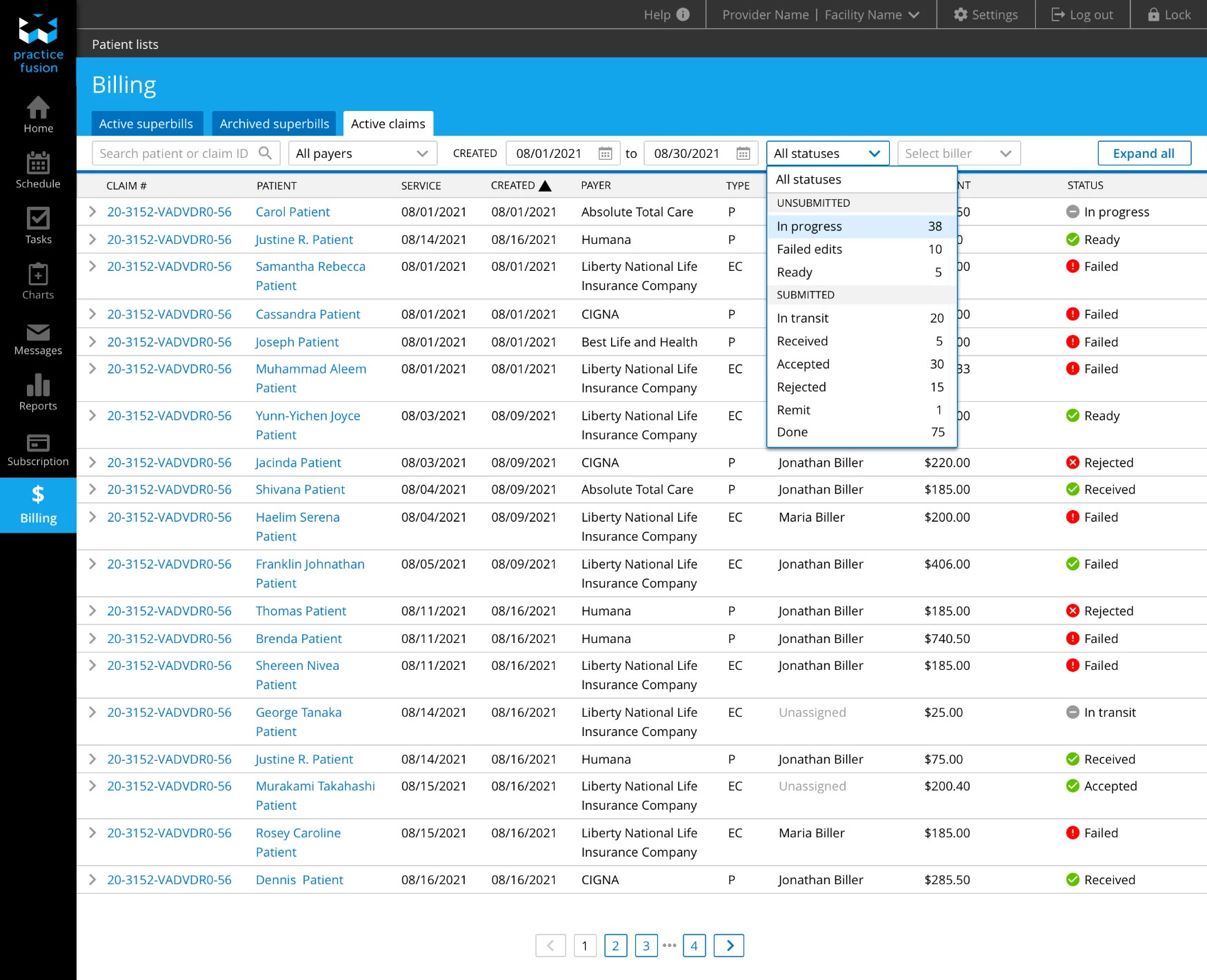
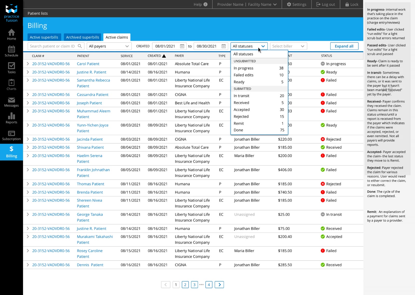
Once the biller submits the claim, I designed the ability for users to track all the claims by viewing their statuses. This helps the practice see what claims have failed or got rejected, and timely re-submit the claims so they do not lose revenue.
And since practices have complained about not knowing the status or what’s going on with claims, I incorporated a “history” tab for insights on the claim.
This would be so, so helpful. When does this launch?
Shifting priorities paused the full build, but this 0-to-1 work laid the foundation for Practice Fusion’s RCMS integration. Designing the Superbill’s split-screen layout and billing templates reduced cognitive load and context-switching, and introducing a biller’s workflow for tracking insurance claims created a revenue-saving mechanism to catch errors before they become costly rejections.
Led subscription flow redesign that increased conversion 360% (15% to 69%) while launching new revenue streams, proving that foundational UX improvements amplify business outcomes.
Practice Fusion creates software that helps medical offices manage their day-to-day operations. Their Electronic Health Record (EHR) system allows healthcare providers to record patient information, book appointments, handle billing, and send prescriptions directly to pharmacies. After a free 14 day trial, customers can sign up for a subscription on a yearly basis.
The existing system restricted users to one-year contracts, forcing them to repeat the entire sign-up flow annually. Additionally, confusing language drove a high volume of customer support calls. Together, the high-friction renewal process and poor content clarity bottlenecked user retention and capped potential revenue growth.
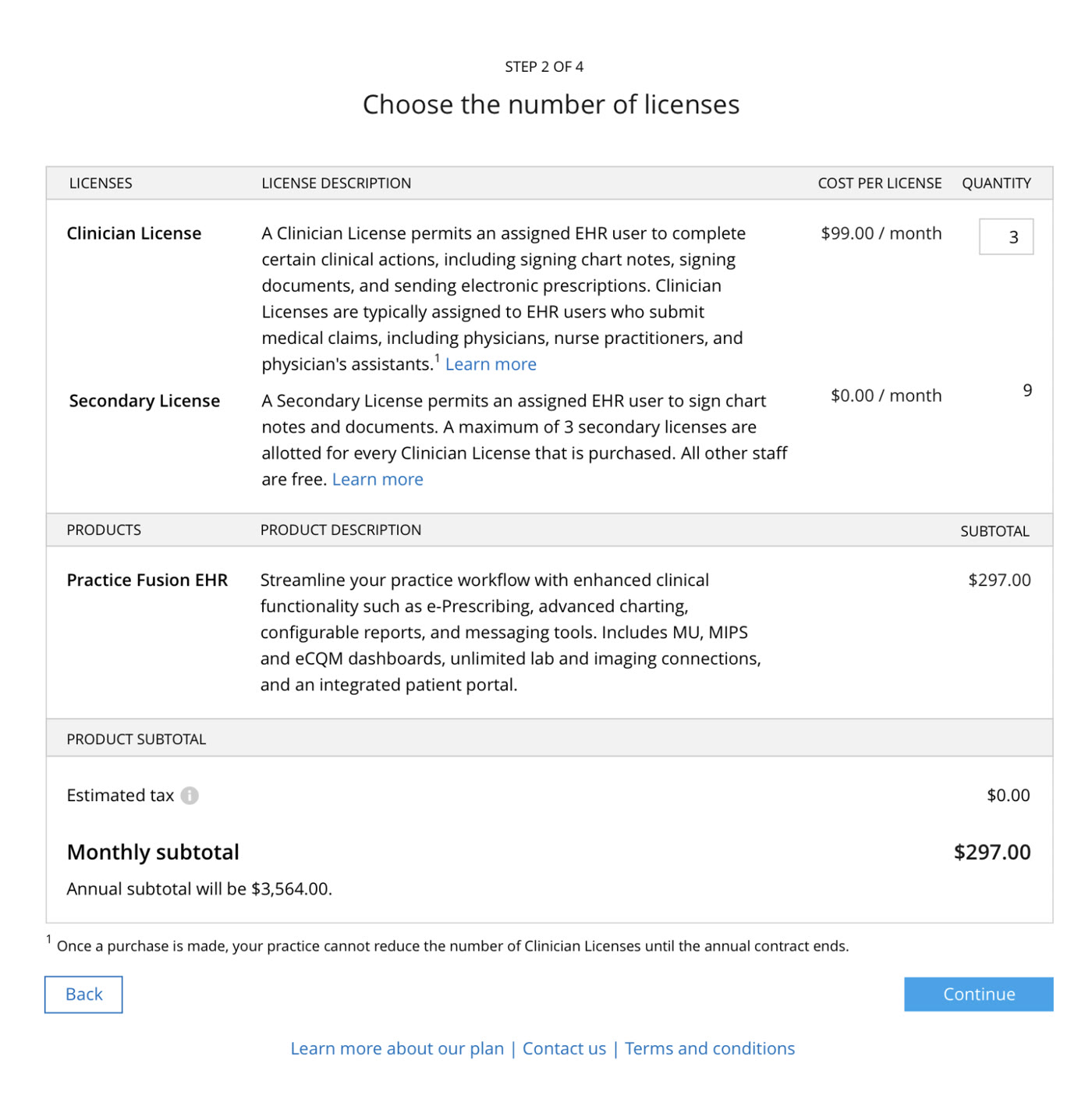
How might we redesign the sign-up flow to support multi-year contracts and third-party add-on purchases, while reducing friction at every step?
When I began the project, the researcher and I realized there were no existing metrics for the subscription flow. We decided to establish baseline data in Mixpanel before designing new features to understand how users were currently navigating the process before adding new functionality.
The baseline data revealed a critical and significant conversion opportunity that reshaped our project approach.
| Step | Users | Conversion from previous step | Drop-off from previous step |
|---|---|---|---|
| Subscription Plan Overview – Continue | 3,075 | — | — |
| Subscription Calculations – Select Clinicians | 751 | 24.4% | 75.6% |
| Subscription Calculations – Continue | 589 | 78.4% | 21.6% |
| Subscription Payment – Complete Order | 470 | 79.8% | 20.2% |
To build context and identify friction points, the researcher and I partnered directly with customer-facing teams across the organization. This included:
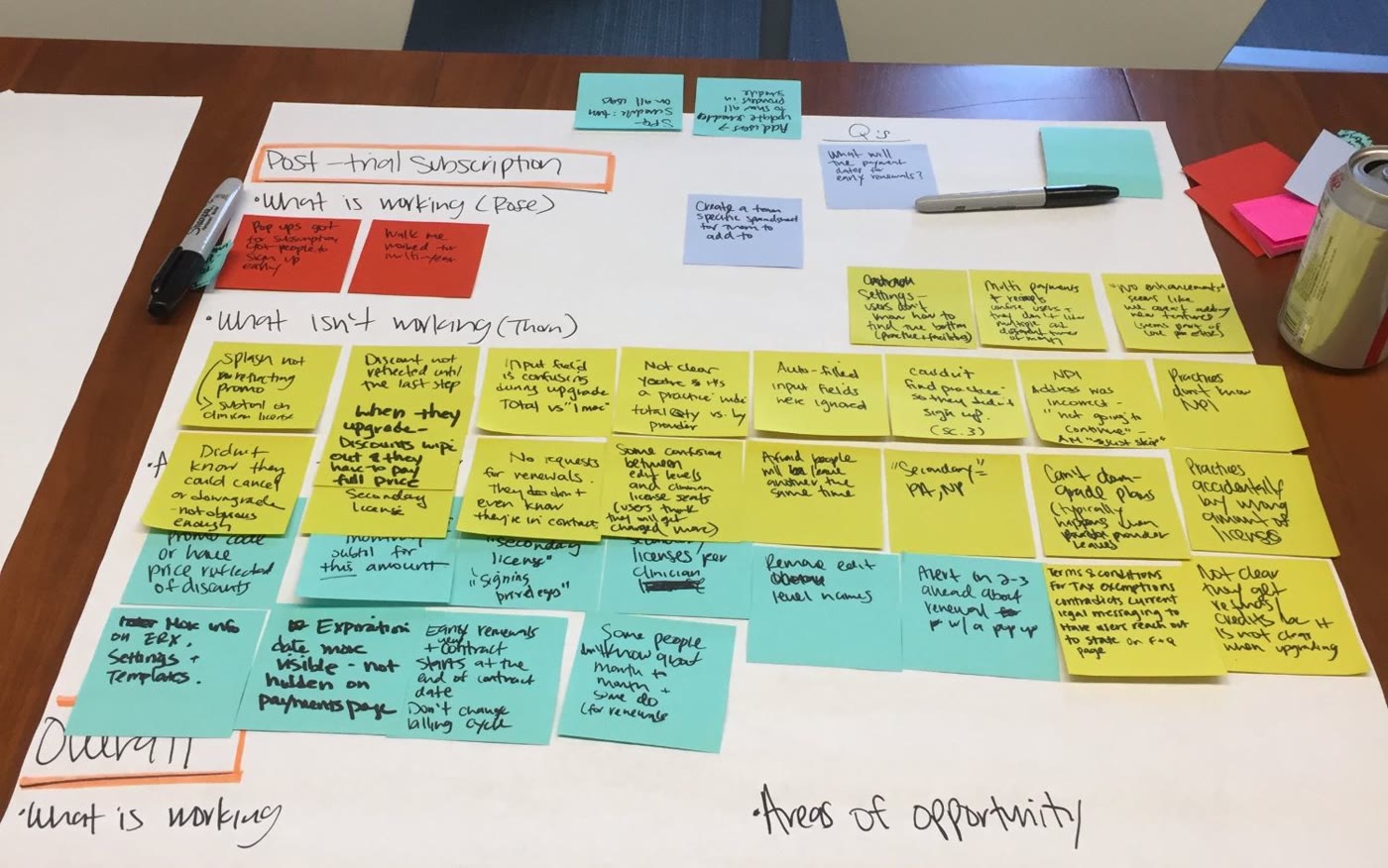
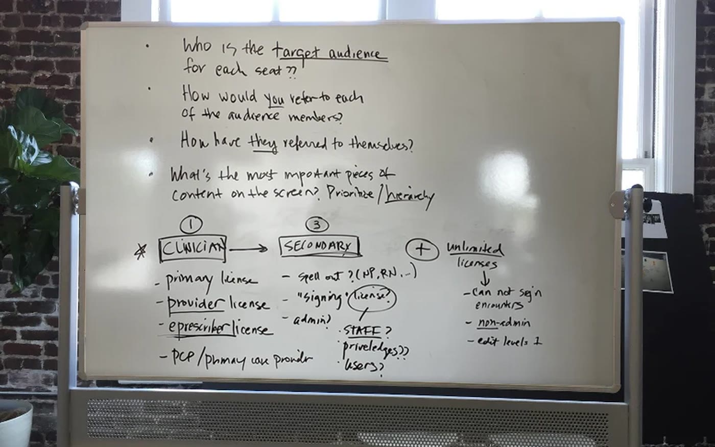
What defines a ‘Clinician’? What does ‘Secondary’ mean? What’s included?
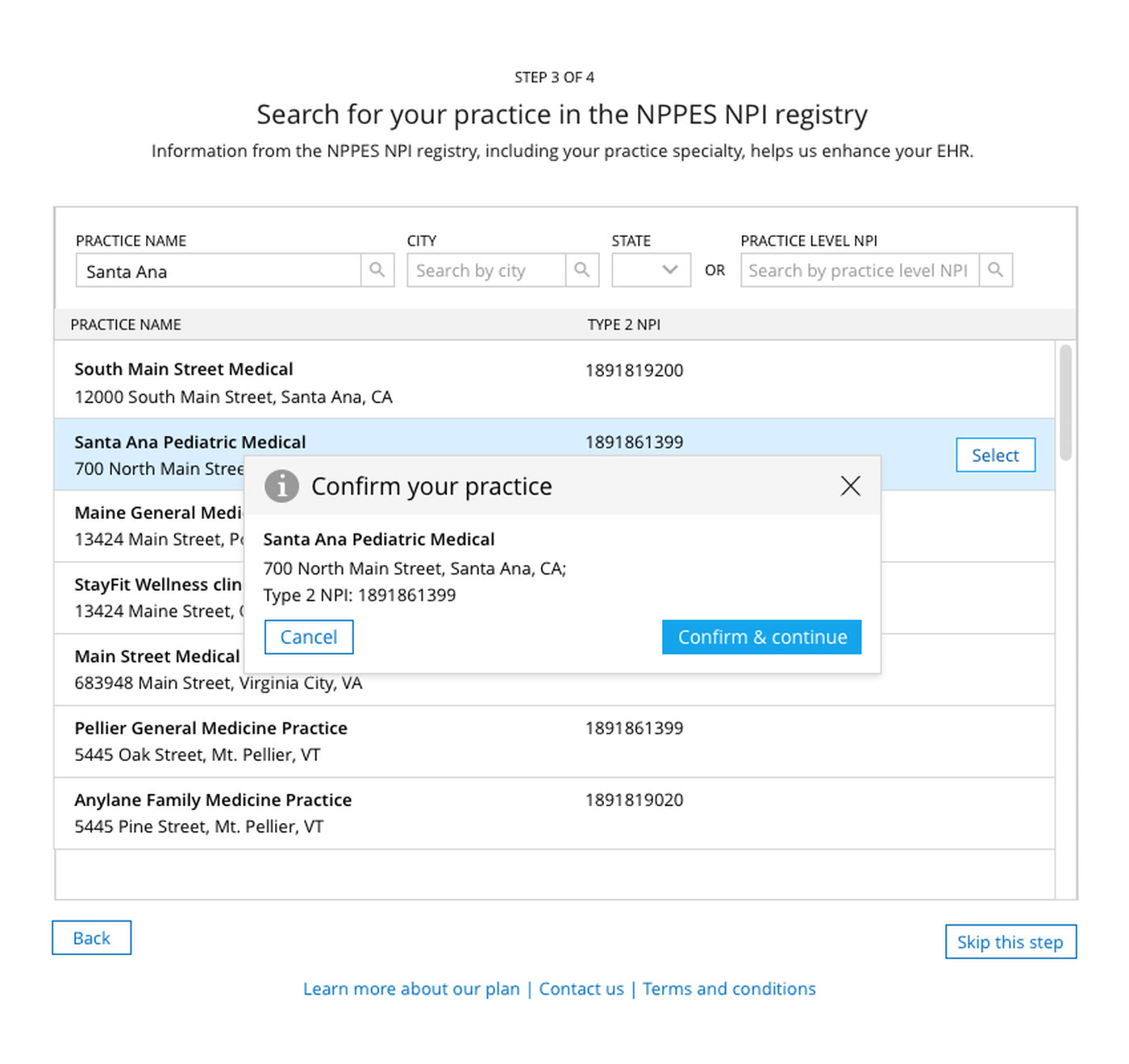
The existing flow overwhelmed users with too much information up front. To fix this, I wanted to test the design by breaking up the flow into smaller, more focused screens to reduce the cognitive load and result in higher completion.
With the Practice Fusion brand refresh happening at the same time, I took this as an opportunity to define a cohesive visual language that could work consistently across both external-facing and in-product screens and improve the hierarchy of information so it was easier to digest and scan.
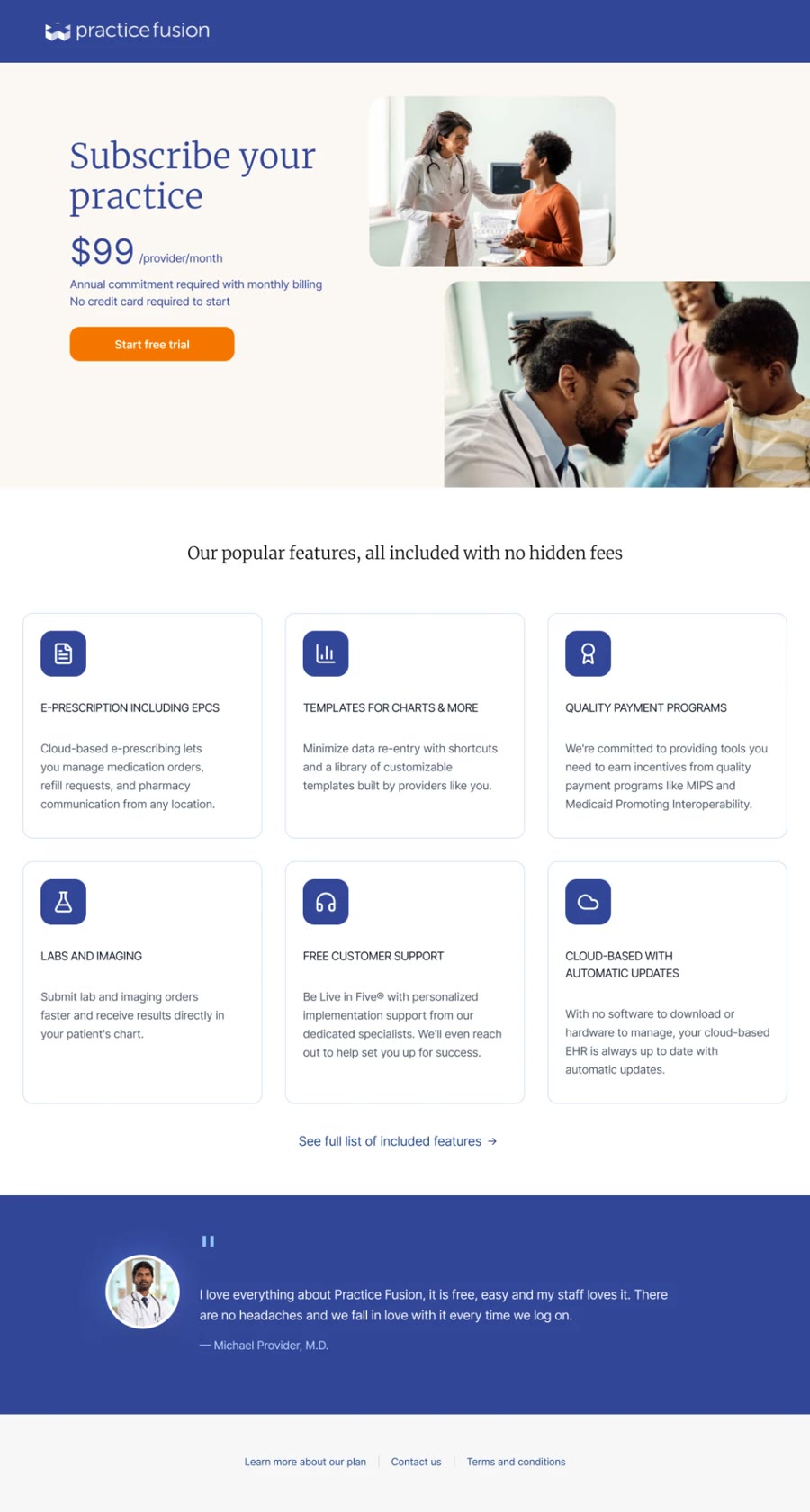
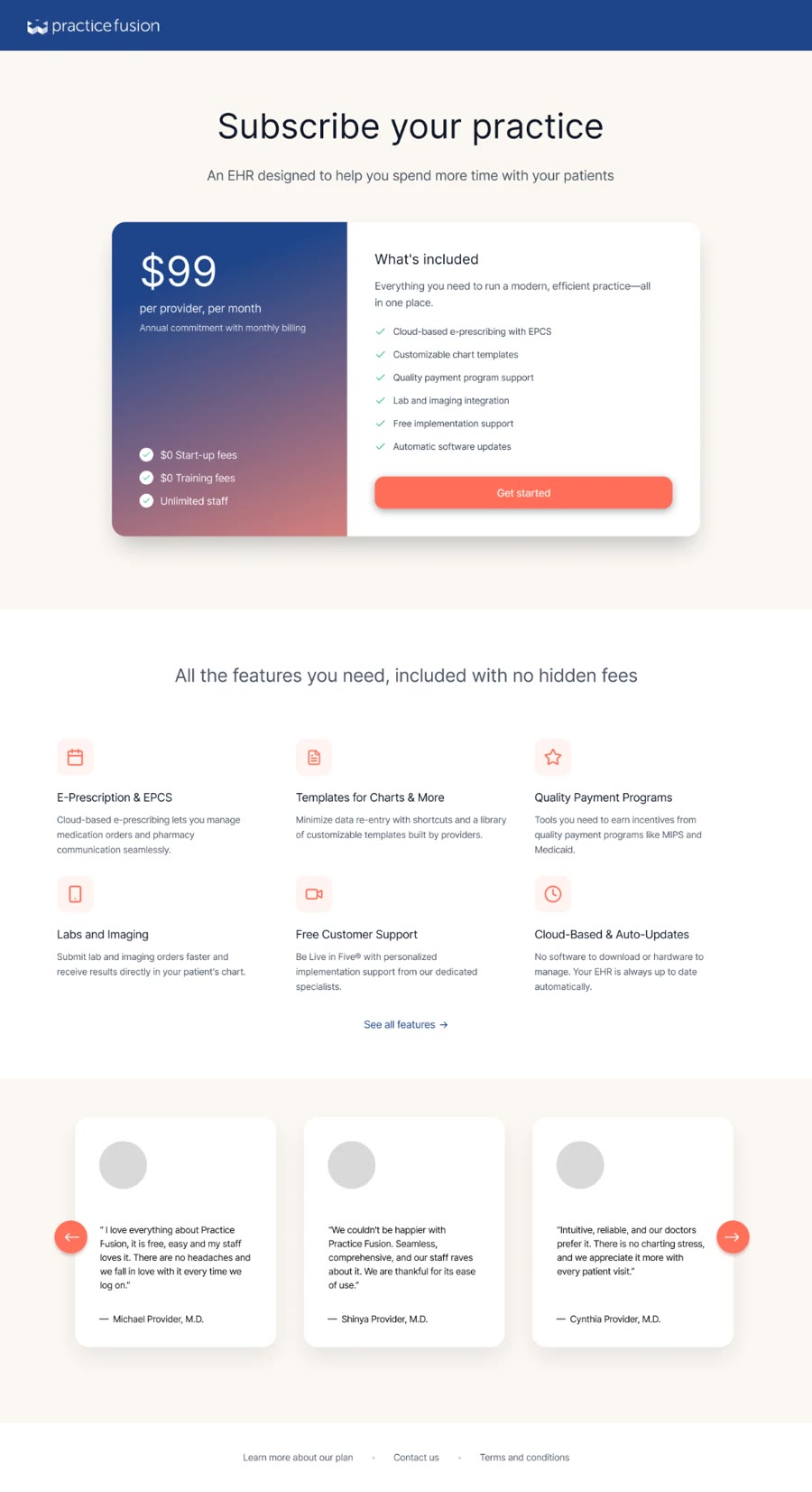
To address the workflow’s highest drop-off point—caused by confusing and dense terminology—the researcher and I brainstormed clearer alternatives for ‘Clinician License’ and ‘Secondary License.’ I then came up with 3 distinct redesign concepts to simplify how licenses can be explained.
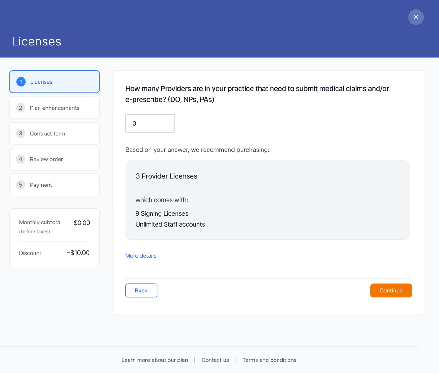
I explored an interactive tool that would allow users to input the number of different roles and staff members and receive recommendations for the appropriate number of licenses to purchase to streamline the complex license structure.
I replaced the table format with a hierarchical structure and explored progressive disclosure to address the cognitive overload that was problematic. However, user research has shown that information icons can go unclicked or unnoticed, resulting in helpful information remaining hidden and leading to customer confusion or incorrect purchasing decisions which was too risky.
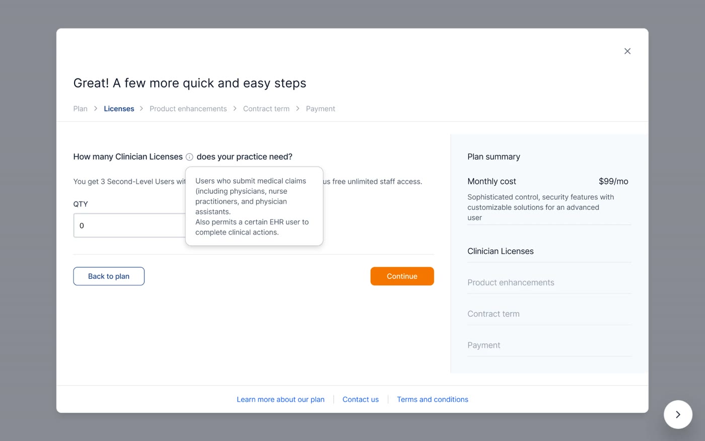
A visual guide introducing the new license names and updated copy, alongside an equation that breaks down the monthly cost calculation. Below it, a dynamic table updates the license breakdown and included permissions based on quantity selected — removing confusion about what’s included at each tier.
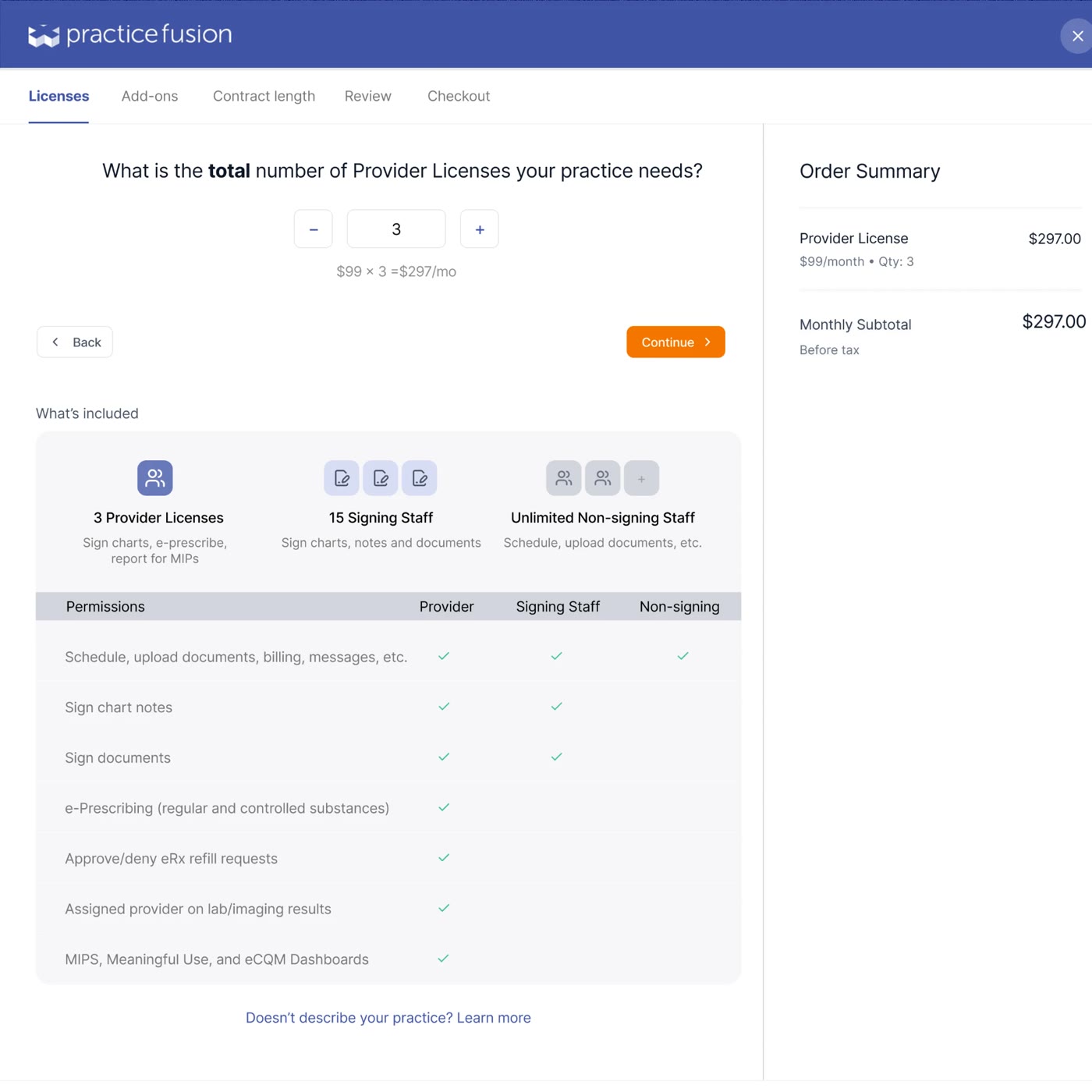
After Concept 3 received positive internal feedback, we tested the design with new and existing customers, validating that the approach was clear and helpful.
The new design makes the purchase process so much more clear. I can finally see exactly what I’m paying for.
A design-driven initiative that strengthened the company’s identity, while delivering more meaningful content for customers.
Practice Fusion is a comprehensive Electronic Health Record (EHR) platform that streamlines day-to-day operations such as scheduling, recording patient information, and billing for medical practices. Following a company acquisition and years of operating as a free service, the business transitioned to a paid, annual SaaS subscription model.
This sudden pricing shift—combined with the uncertainty of the acquisition—caused frustration and distrust among our existing users. Customers questioned the platform’s future and the value they would be getting for their money. Additionally, the current website weakened credibility, presenting a disjointed brand image that felt outdated and impersonal.
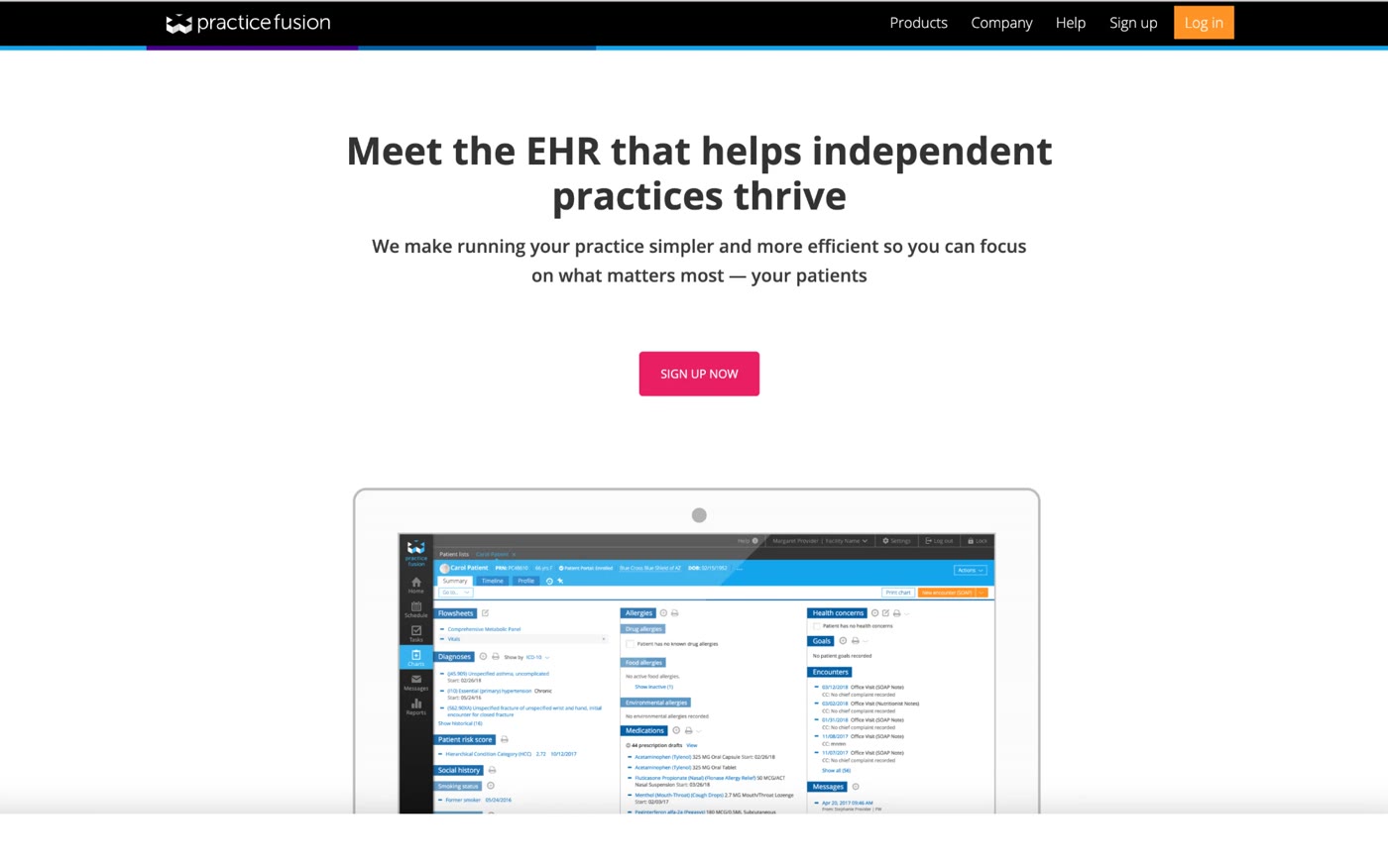
How might we redesign Practice Fusion’s brand to rebuild customer confidence, communicate stability, and reestablish the value of the platform during a period of major transition?
Initiating an off-roadmap rebrand for Practice Fusion required significant alignment across the org. Partnering with the Design Director, I pitched the business value to 30 stakeholders, including the C-suite, marketing, sales, legal, and engineering leads.
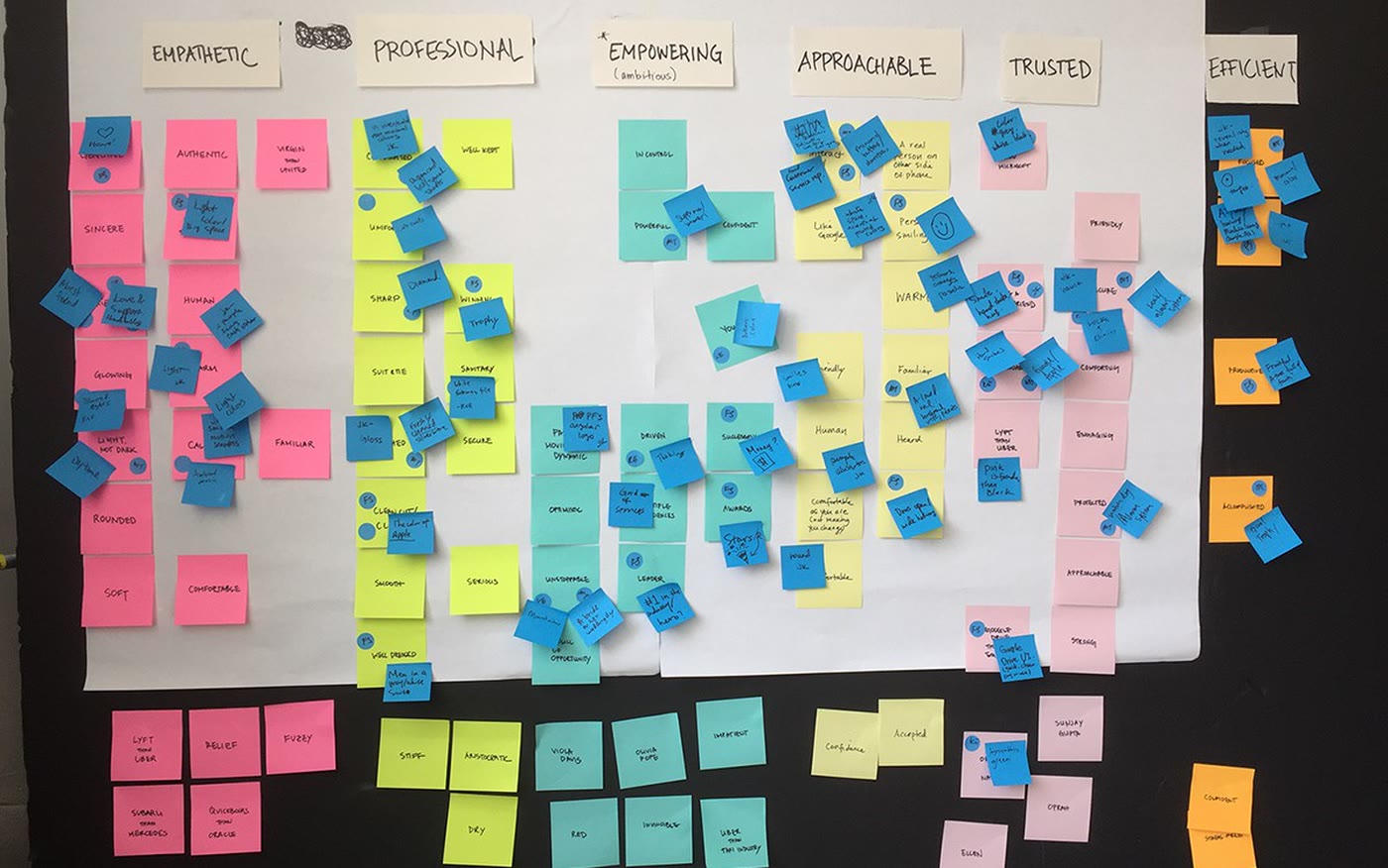
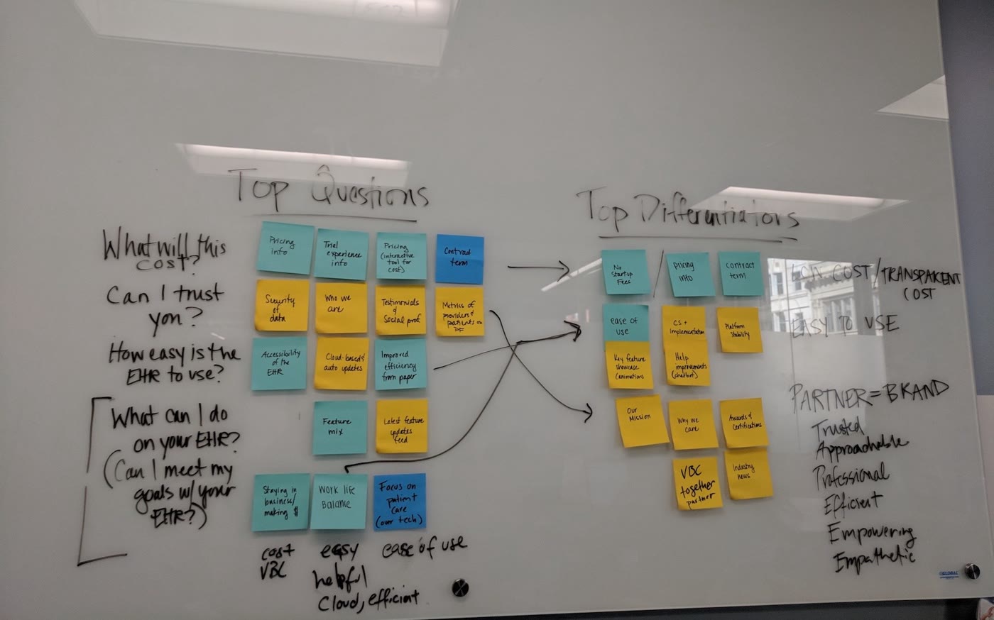
To secure buy-in and reimagine our outdated website, I facilitated two branding workshops. I led interactive activities to generate excitement and momentum for the project, and successfully gained alignment on six core brand attributes: Trusted, Empathetic, Empowering, Efficient, Professional, and Approachable.
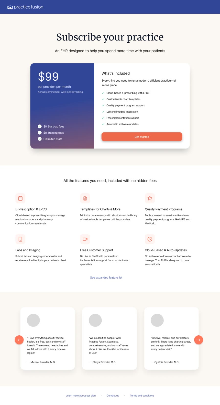
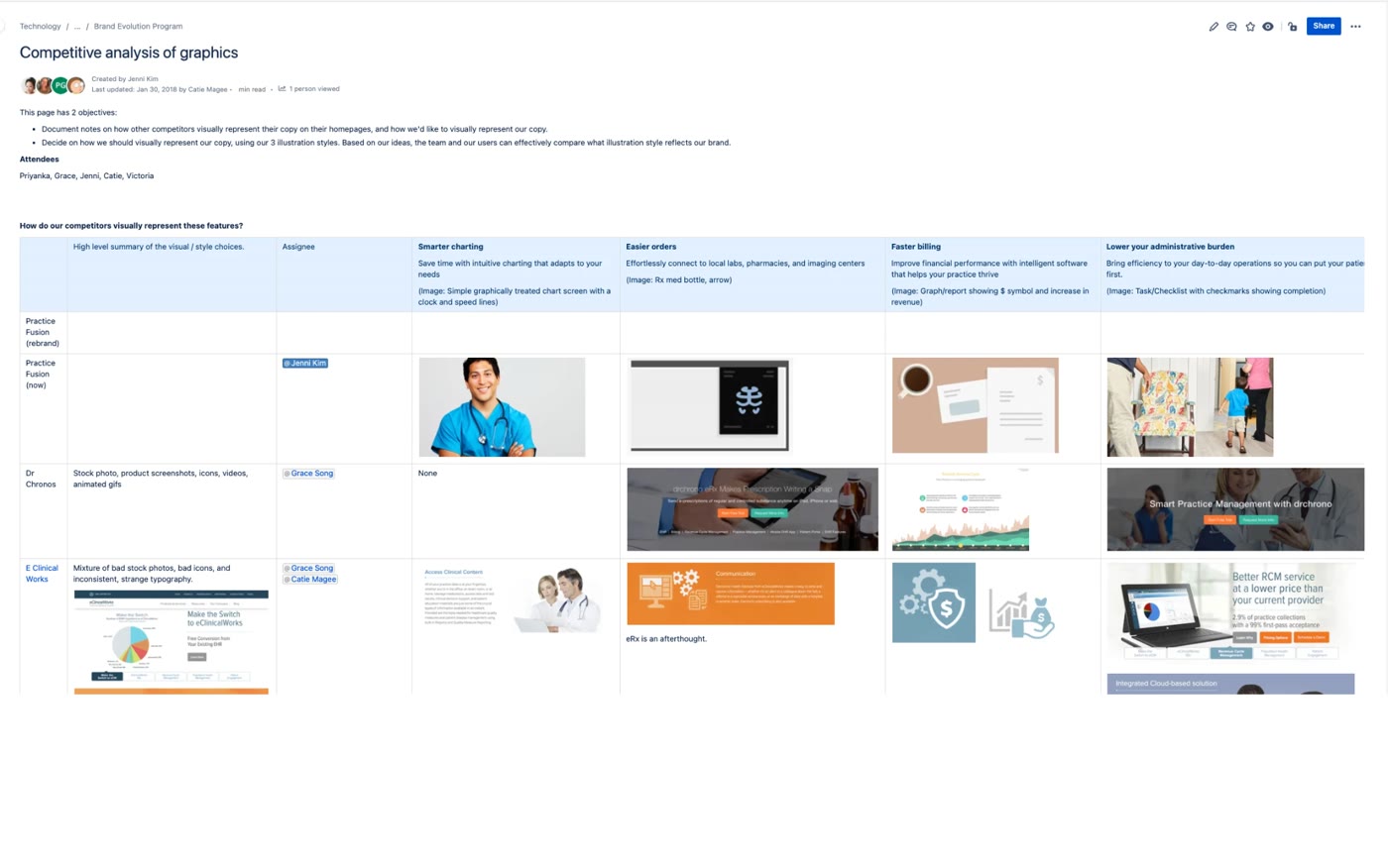
We compared images on how the competitors visually represented their brands and we analyzed the content on their homepages to gather ideas for enhancing our new homepage. Our goal was to incorporate more value propositions and convey our new brand attributes.
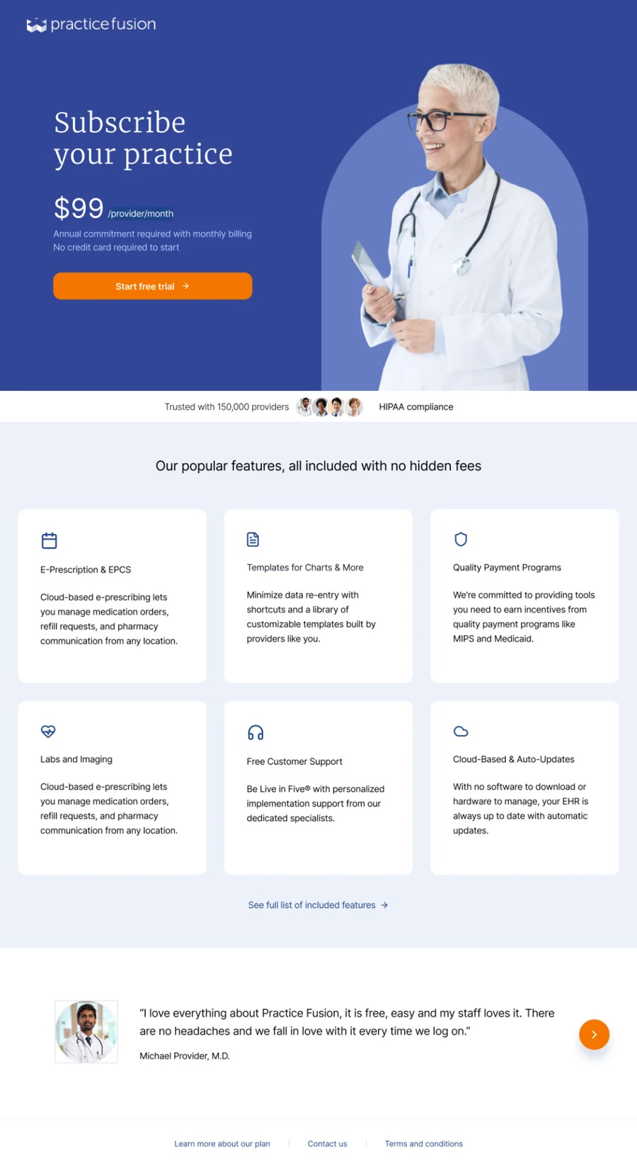
By including Marketing and Sales into this initiative, the design director, researcher and I learned that customers are constantly asking about how much the product costs, and details around subscribing to the software. We brainstormed ideas on what information would be meaningful based on insights and anecdotal information.
The existing website relied heavily on device imagery and generic stock photos — impersonal and visually forgettable. With a photoshoot ruled out due to budget, I explored an illustrative approach to reimagine what healthcare branding could look like.
I defined the creative brief and built templates for the designer to work from. From there, I partnered with the lead researcher to develop objectives and survey questions aimed at measuring how well each direction reflected our target brand attributes — evaluating both with 40 participants.
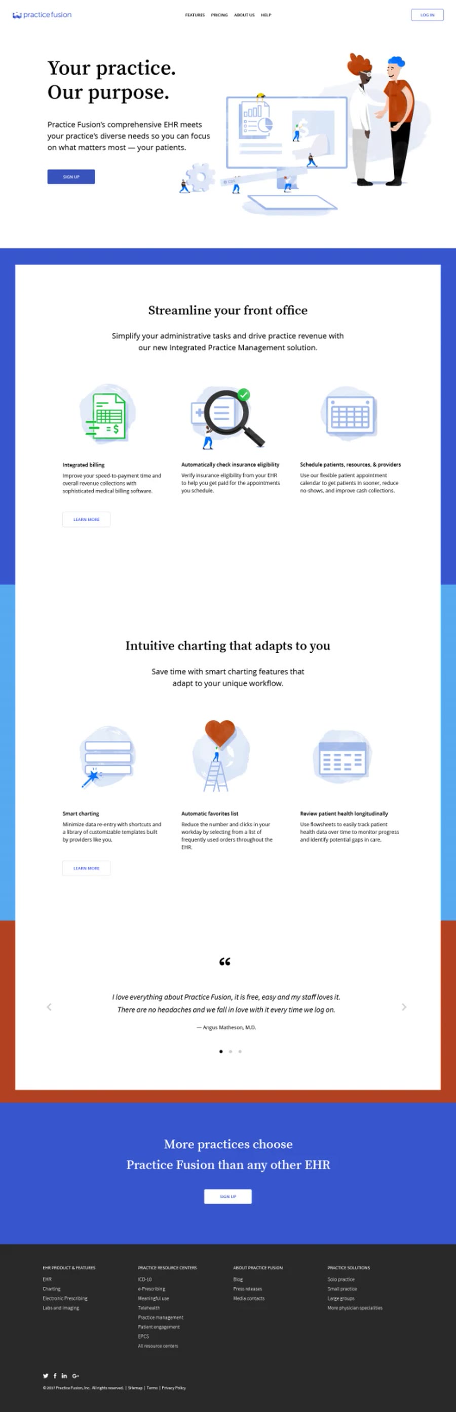
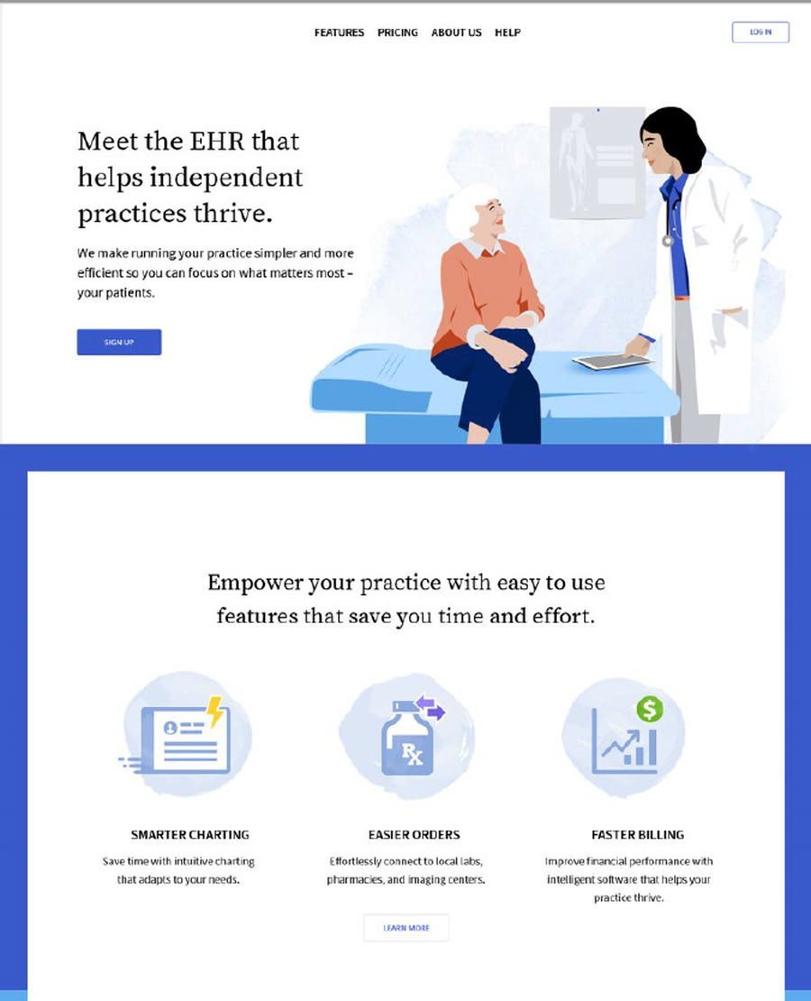
The cartoons are clean and approachable, but I wouldn’t call it professional looking exactly.
Despite our effort to bring personality and distinct look and feel into the brand, the overall feedback was that these illustrations did not look professional enough.
We revised our illustrations based on the key learnings from the first round by making the characters look more human. I collaborated with the researcher to come up with survey questions, and we did a second round of testing to gather feedback.
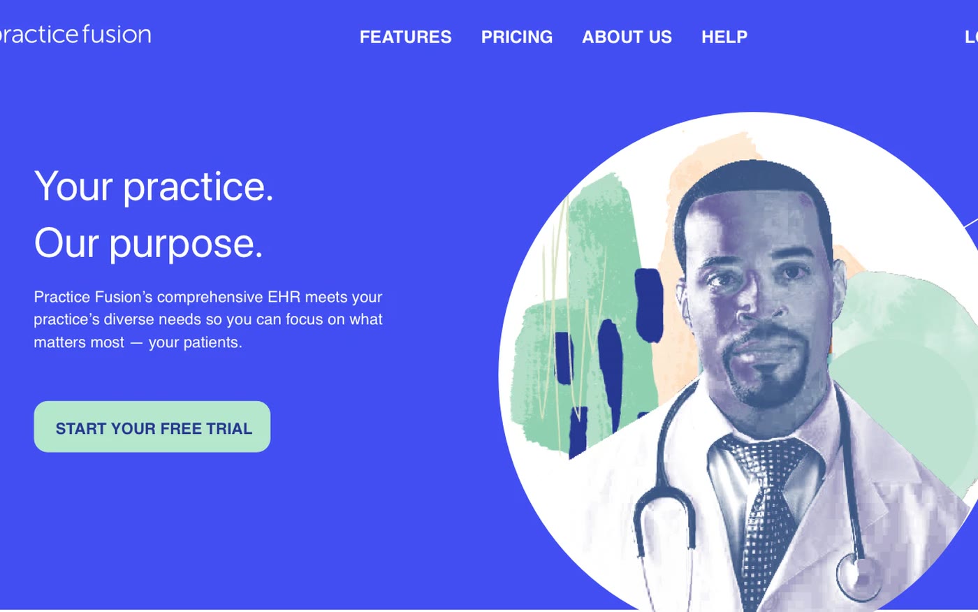
I’m dealing with medicine, I want to see real people.
Across two rounds of user testing, participants consistently responded more favorably to real photography than the illustrated directions. Despite initial resistance due to budget constraints, I used that feedback to make a convincing case to stakeholders to secure buy-in and budget for a dedicated photoshoot.
As the brand lead, I refreshed the color palette and typography to feel warmer and more human — and ensured all colors and type met WCAG accessibility standards.
Working closely with my design director, I led the photoshoot end-to-end — casting, wardrobe, scene direction, and image selection — centering healthcare providers and patients to bring credibility, connection, and warmth to the brand. With customers needing reassurance during this transition, we moved away from heavy device imagery and generic stock photos toward a look that positioned us as partners.
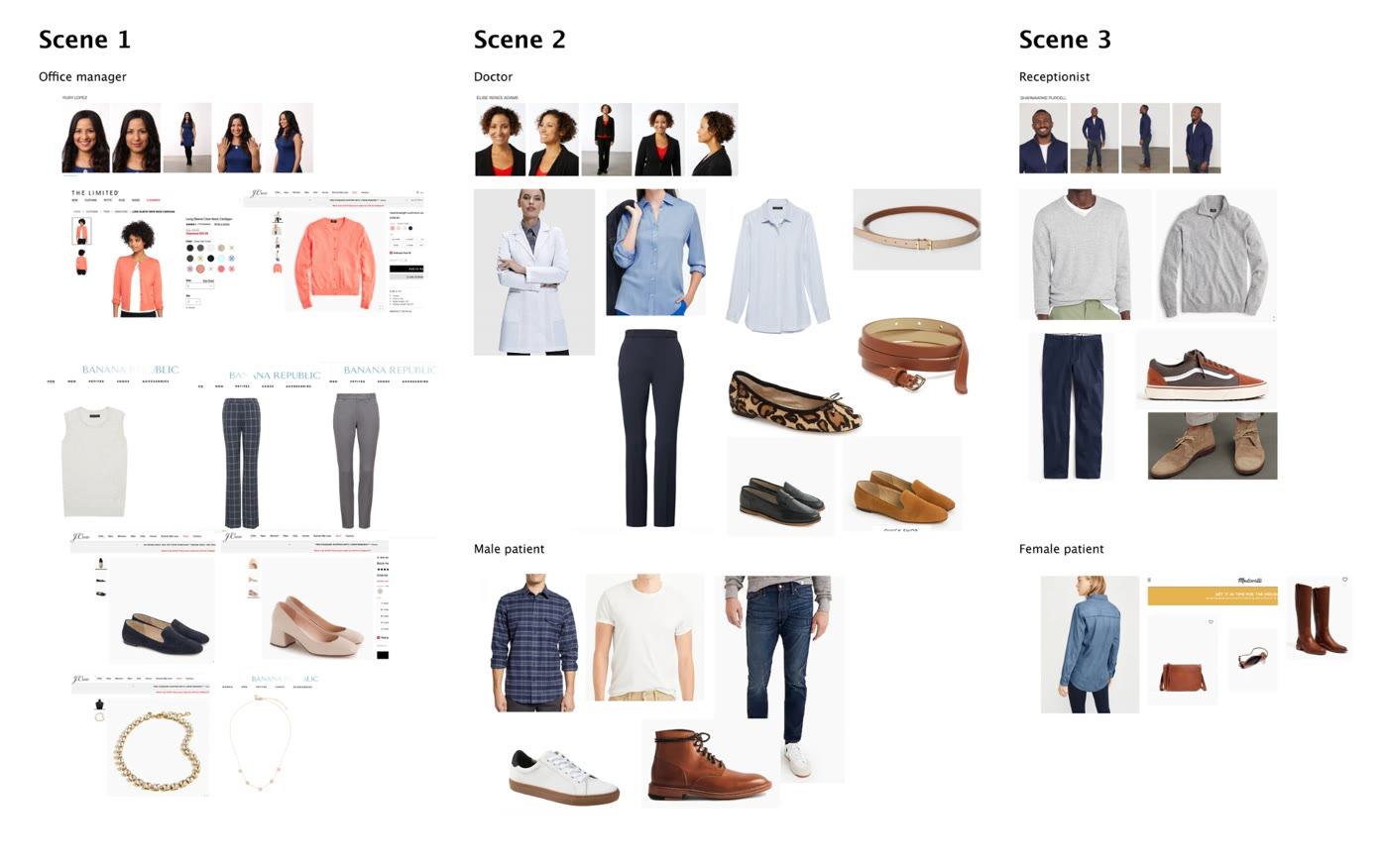
Casting and wardrobe planned scene by scene
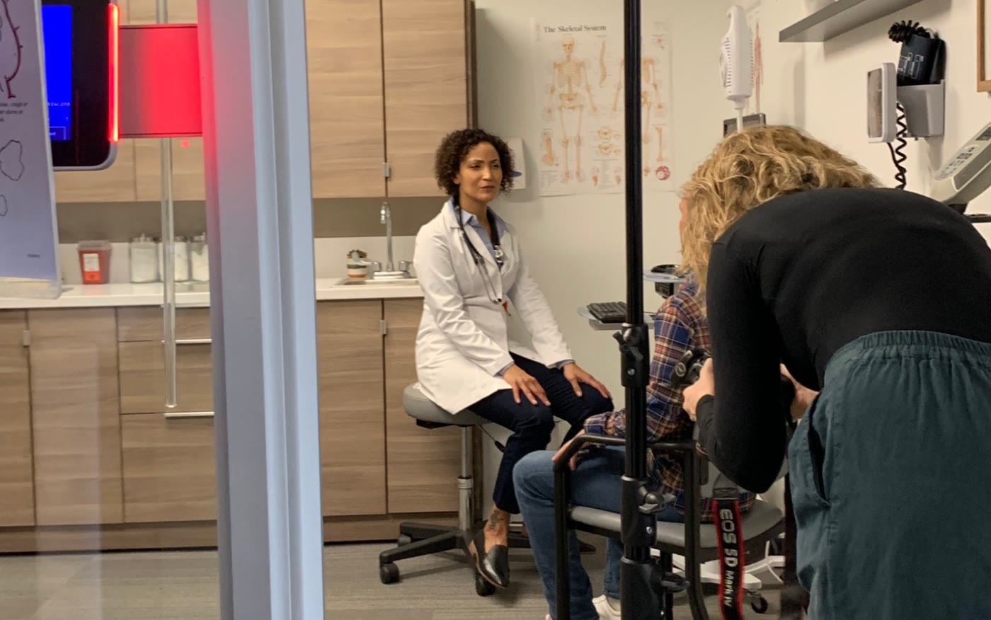
On set in the exam room

One of the final images
We revised our illustrations based on the key learnings from the first round by making the characters look more human. I collaborated with the researcher to come up with survey questions and we did a final round of testing.
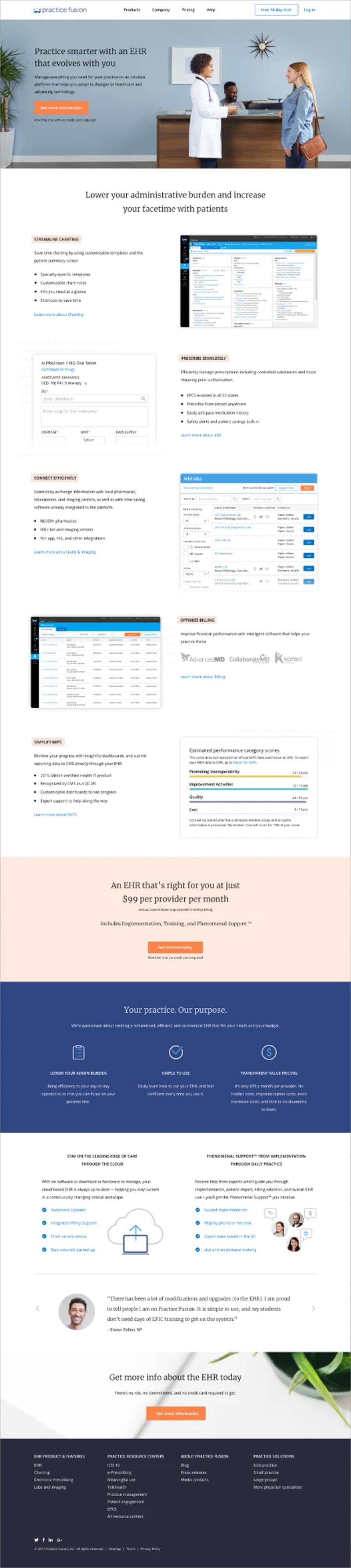
This photo gives me the impression that the provider is relaxed. It makes me think to myself: I want to be that relaxed at work too.
While the original website lacked clear baseline data, the design, research, and marketing teams used this project as an opportunity to enhance their tracking of baseline data.